Here are some aspects of design that you might want to consider when creating your “Little Magazine”.
Colors:
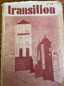
Primary colors are always a good go to for modern design. Think bold, bright and simple. Black and white is classic and always does the job.
Font:
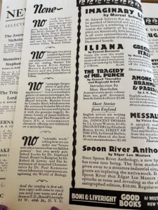
You want to use bold fonts with a classic feel. Pick a few fonts and try to keep the same basic font streamlined throughout, using the bold and italic settings to add character. Go for something eye catching for the front page. Cursive fonts are not as popular at this time but can be used in tandem with classic fonts.
Shapes:
Squares are all the rage. Strong, defined lines, and simple, yet bold shapes are the best bet. Cubism and simplicity are the idea. Circles can be used, but the “shape” of your magazine should not be soft.
Layout:
Page numbers are optional, but useful.
The title of the magazine should be seen throughout.
Including more than one art form makes your magazine more well-rounded.
Get weird with it.
Get weird with it!